
Anaglyph second lesson: Grayscale
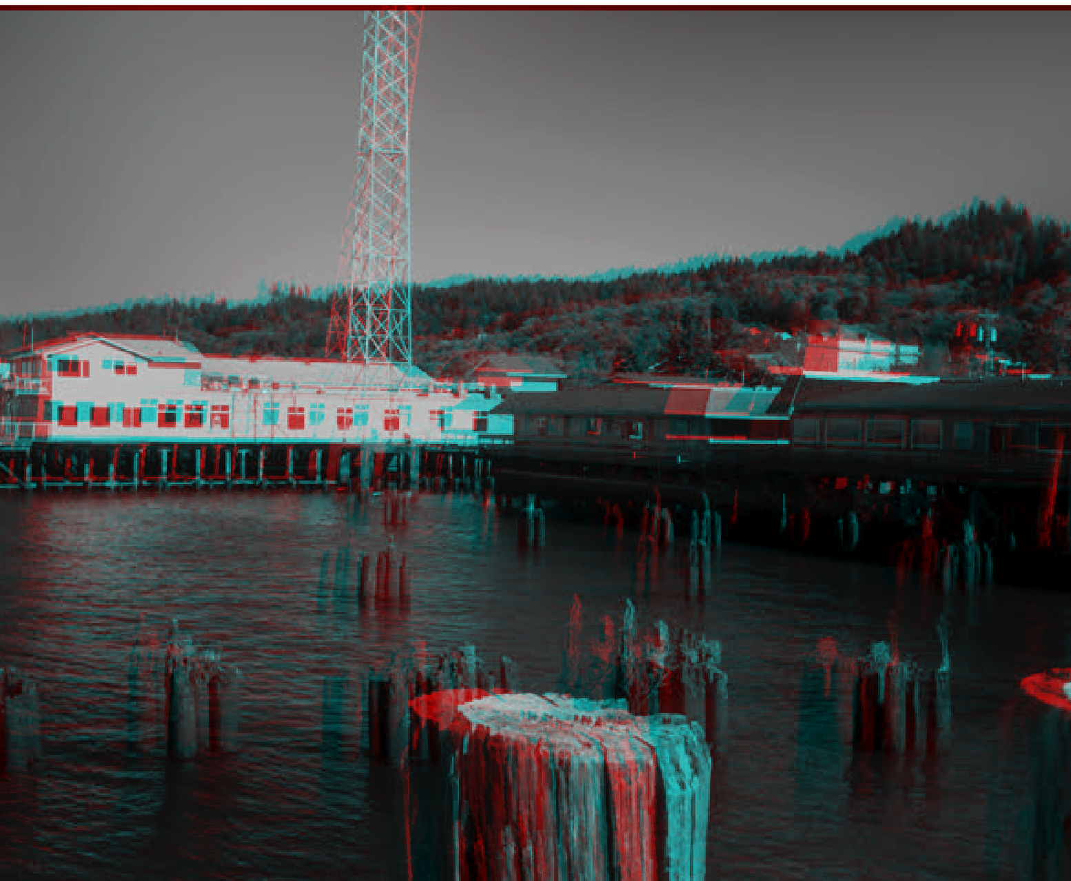
For our next trick, we start working on actual images. Take a photo with a good clear subject and convert it to grayscale. Then follow the steps here to make an anaglyph. It’s very similar to the B&W version except if you were using masks or fill tools to separate the colors before, now you will have to reckon with layer adjustments.
BONUS CHALLENGE!
So far, we have taken two copies of an image and simple translating one a bit to the left. It is important to recognize that only translations along the horizontal matter here (your eyes are separated only along that axis, after all) but that doesn’t mean you don’t have options. While avoiding vertical adjustments, you can still have some fun. Let’s go back to an early example, the word “Anaglyph” written several times:
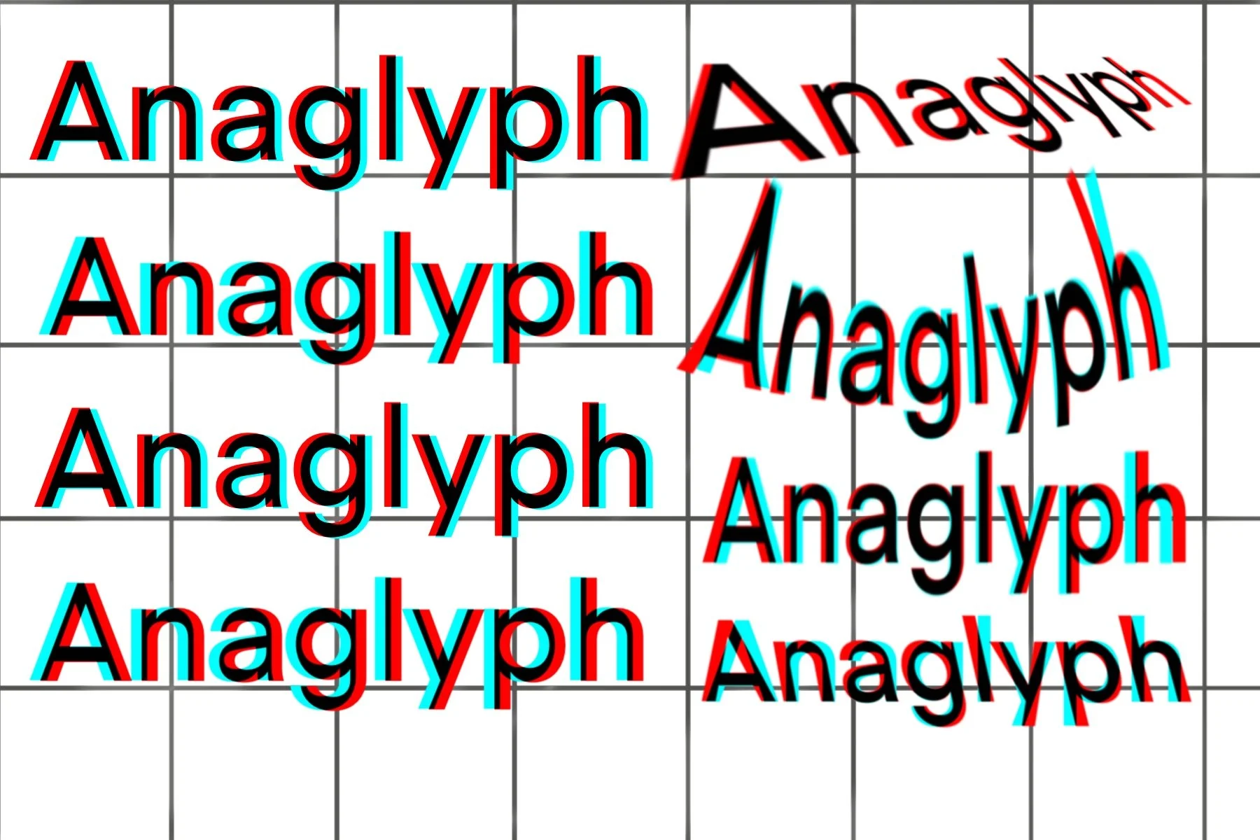
In the top left corner we see the word Anaglyph adjusted just like we instructed. You can first experiment with increasing or decreasing the distance between the red and cyan channels (works best if you have multiple trials on one picture, as you want to compare them). Then try moving CYAN to the left - compared to the first example, it should appear as if it’s receding into the page!
In the right-hand column you can see more advanced variants. Utilizing skew, warp and arc functions in your program, you can do things like start the word with red to the left, then slowly change it so that the cyan is on the left. You can change the distance between the red and cyan layers as you travel down the axis of the letters (bottom right example) Just remember to avoid VERTICAL translations and stick to horizontal ones, that is the only rule.